30 Jaw Dropping Blue Kitchen Cabinet Ideas that will Bring Bold Color and Timeless Charm into Your Home
Discover stunning blue kitchen cabinet ideas to bring timeless charm home. These bold designs create a welcoming, beautiful culinary space!
Walking into your cooking space should immediately spark joy and creativity. If you are exploring blue kitchen cabinet ideas, you already know that adding color completely revitalizes the heart of your home. Standard white and gray layouts often feel a bit too safe and predictable after a while. Introducing rich, vibrant tones brings immense personality and an undeniable sense of elegance. In my experience, shifting away from neutral palettes toward deep navy or soft cerulean instantly makes the room feel more curated and welcoming. I have noticed that families tend to gather much longer in spaces that feature this warm, inviting aesthetic. You will find plenty of practical inspiration below to help you confidently design a stunning culinary retreat.
Navy Blue Lower Cabinets
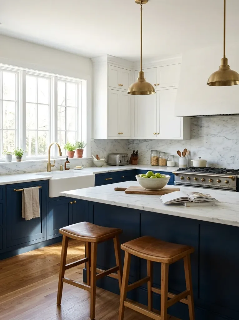
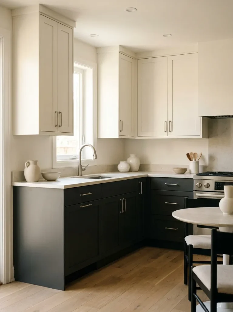
Grounding your layout with dark bases anchors the entire room without making the upper half feel heavy or cramped. It creates a beautiful grounding effect that draws the eye downward while maintaining an airy, open feel near the ceiling. I have seen this work beautifully in homes lacking massive square footage.
Pairing this bold foundation with lighter uppers keeps the space feeling exceptionally bright and spacious. This two-toned approach provides the perfect balance between dramatic color and necessary brightness. It works incredibly well to hide everyday scuffs while keeping the overall aesthetic remarkably fresh.
Glossy Cobalt Finishes
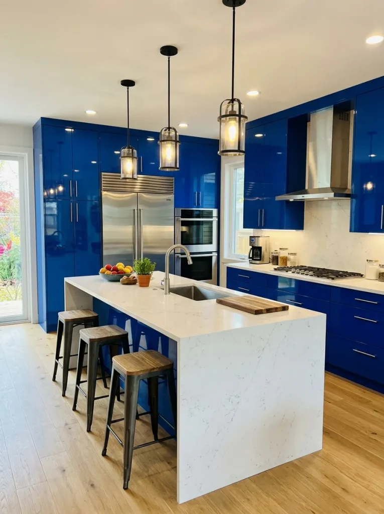
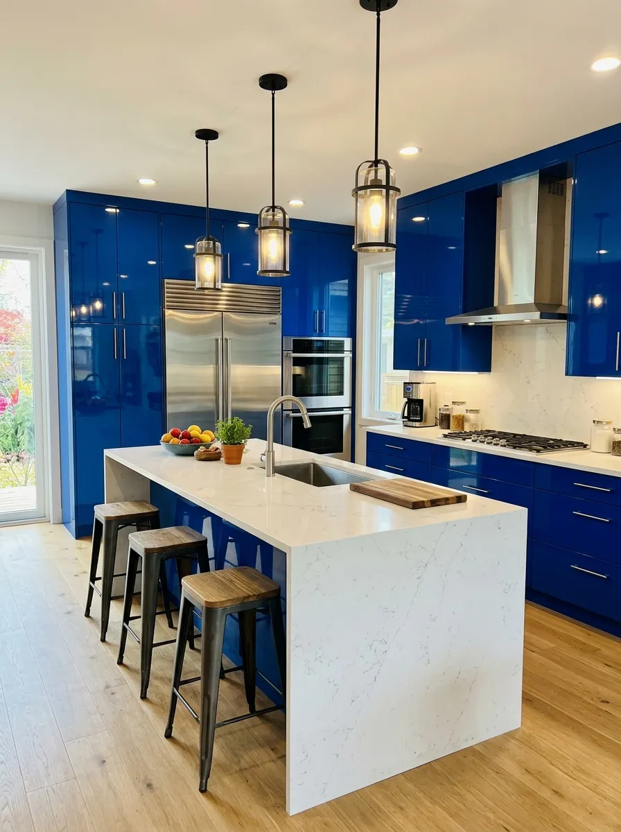
- High-shine surfaces reflect light across the room, making tight layouts appear much larger than they actually are.
- Glossy finishes wipe clean easily, offering a highly practical solution for busy households prone to spills.
- Vibrant cobalt adds a highly modern, energetic pulse to otherwise standard contemporary architecture.
- Pairing highly reflective doors with matte countertops creates a stunning textural contrast that feels professionally designed.
Injecting high-gloss color demands attention the moment someone walks into the room. This bold choice fits perfectly into ultra-modern spaces craving a massive pop of personality. I have noticed that highly reflective materials completely eliminate the need for extra decorative clutter because the cabinetry itself becomes the main feature.
Soft Slate Blue Islands
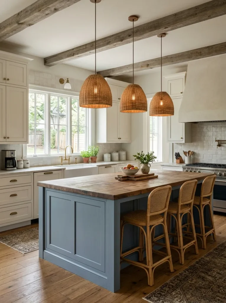
Quick Tip: If you feel hesitant about committing to a fully colored room, start by painting only the center island. This creates a distinct visual focal point without requiring a massive design leap.
Soft slate tones introduce just the right amount of color to a neutral room. The muted grayish-blue acts almost like a neutral itself, pairing seamlessly with natural wood elements and metallic accents. It immediately grounds the center of the room, making it the perfect gathering spot for family breakfasts.
Classic Shaker Style Doors
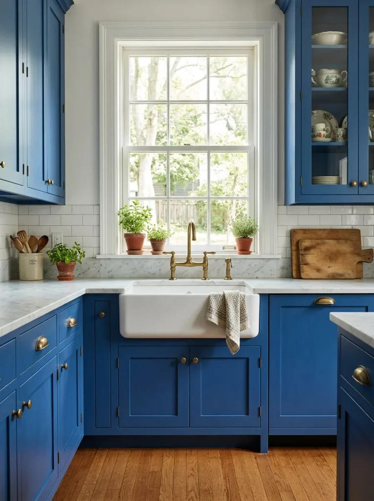
Before: Builder-grade oak doors often leave older layouts looking dated, tired, and entirely uninspired. The room lacks a distinct personality and blends into every other standard design.
After: Coating those traditional frames in a vibrant royal hue completely modernizes the architecture. The space instantly feels rich, intentionally crafted, and historically charming all at once.
Shaker profiles offer clean lines that take color exceptionally well. The recessed center panels create beautiful shadows that highlight the depth of the chosen hue. That is why many experts recommend this specific combination for achieving a style that remains visually stunning year after year.
Matte Teal Upper Cabinets
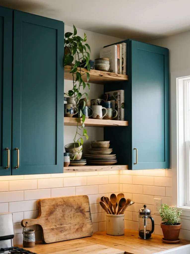
- Remove hardware and thoroughly sand the existing frames to ensure perfect paint adhesion.
- Apply a high-quality bonding primer to prevent the dark teal from bleeding into the wood.
- Use a foam roller or professional sprayer to achieve a flawless, flat matte finish.
Flat finishes absorb light, giving the room a remarkably soft and velvety appearance. Positioning this unique texture at eye level brings immediate artistic flair to your daily routines. I always suggest pairing this muted texture with bright white backsplashes to keep the upper half of the room feeling crisp.
Gold Hardware Contrasts
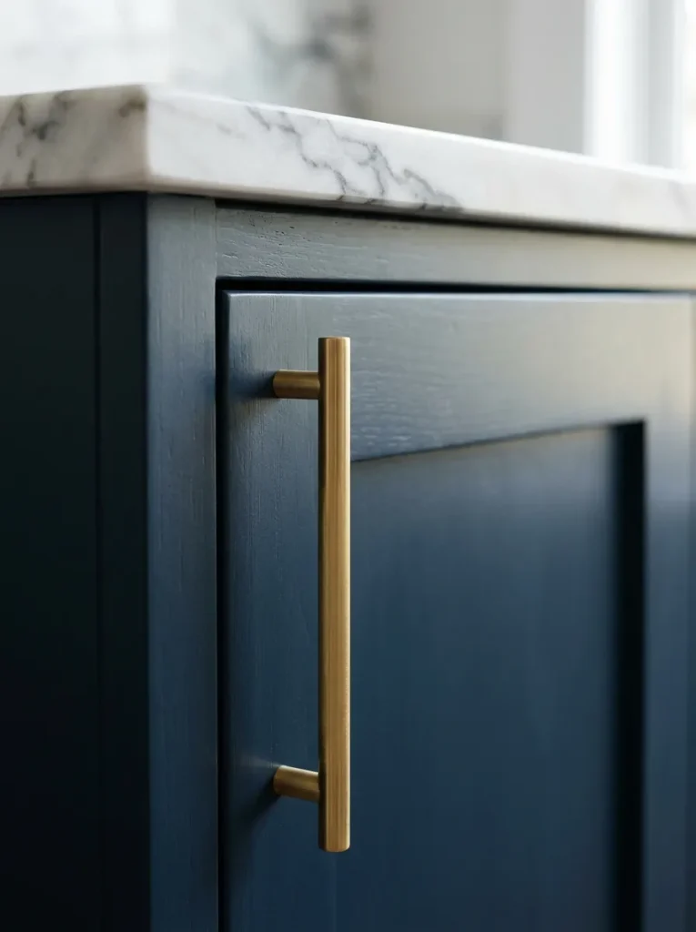
| Hardware Finish | Visual Effect | Best Used For |
| Polished Chrome | Cool and clinical | Ultra-modern layouts |
| Matte Black | Industrial and heavy | Rustic farmhouse spaces |
| Brushed Gold | Warm and luxurious | Classic colored cabinetry |
Warm metals pop dramatically against cool-toned paints, creating an instantly expensive aesthetic. Swapping out standard silver knobs for rich champagne gold requires very little financial investment. I have seen this simple hardware upgrade completely redefine a cooking space, making the entire layout look like a custom professional build.
Glass Front Display Doors
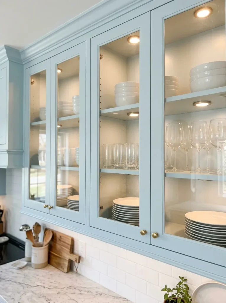
- Do install interior lighting to showcase your favorite dishware beautifully.
- Do use glass fronts to break up a heavy wall of solid color.
- Do paint the inside of the box the exact same shade.
- Don’t use transparent doors if you struggle to keep your shelves organized.
- Don’t mix too many brightly colored plates inside the display.
- Don’t forget to clean the glass regularly to maintain a pristine look.
Transparent inserts add necessary visual relief when working with strong color palettes. They draw the eye deeper into the wall, giving the illusion of expanded square footage. This elegant detail provides a perfect opportunity to display heirloom pieces while keeping the overall design feeling incredibly light and open.
Beadboard Cabinet Backing
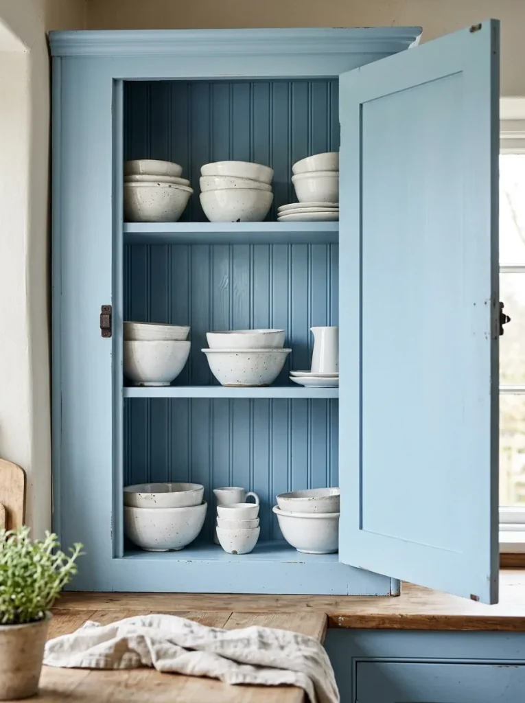
- Style Factor: Vintage and highly charming
- Skill Level: Beginner-friendly weekend project
- Visual Impact: Adds immediate depth and texture
- Maintenance: Wipes down easily with a damp cloth
Adding textured panels behind open shelving introduces a wonderful layer of traditional craftsmanship. The vertical lines of the beadboard draw attention to the height of the room. It is a highly effective way to inject subtle architectural interest without committing to a full structural remodel.
Dark Sapphire Pantries
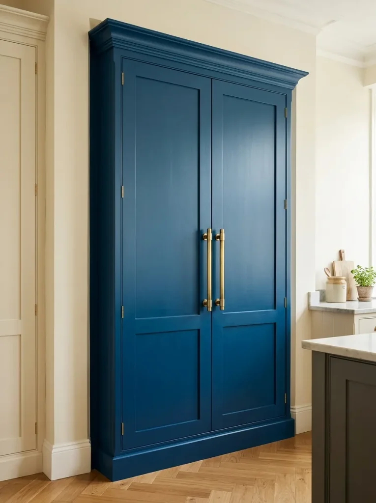
Dedicating an entire storage wall to a dark, moody hue creates a magnificent anchor for the room. A massive floor-to-ceiling unit painted in rich sapphire feels more like a piece of high-end furniture than standard kitchen storage. I have noticed this approach adds incredible drama to an otherwise plain layout.
Keeping the surrounding walls light ensures this massive block of color does not overpower the room. It allows the pantry to shine entirely on its own as a brilliant focal point. This clever distribution of visual weight makes the whole environment feel incredibly intentional and beautifully balanced.
Pastel Blue Ceilings
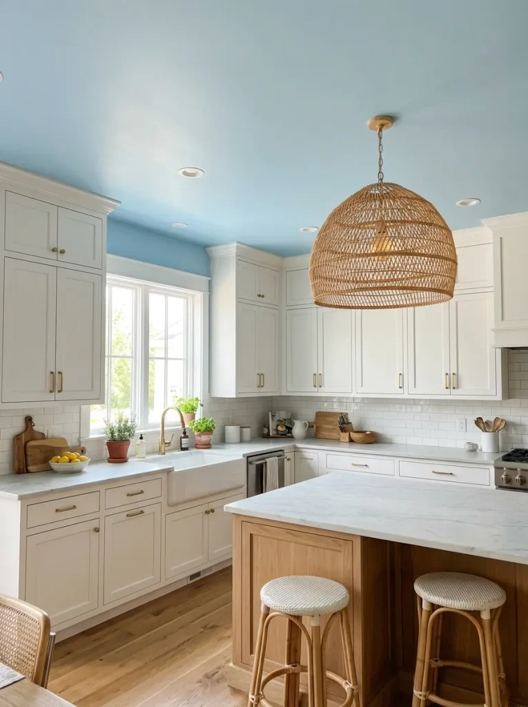
- Extending color upward draws immediate attention to architectural details like crown molding.
- A soft pastel hue mimics the natural sky, making small, enclosed layouts feel expansive.
- Keeping the actual cabinetry white while coloring the ceiling offers a highly unique twist on traditional design.
- This technique reflects ambient light downward, softening harsh shadows across your countertops.
Looking up and seeing a wash of gentle color completely transforms the atmosphere of the room. Most people completely ignore the fifth wall when designing their homes. Painting it offers a brilliant, unexpected design element that fills the space with an incredibly joyful and airy energy.
Distressed Vintage Finishes
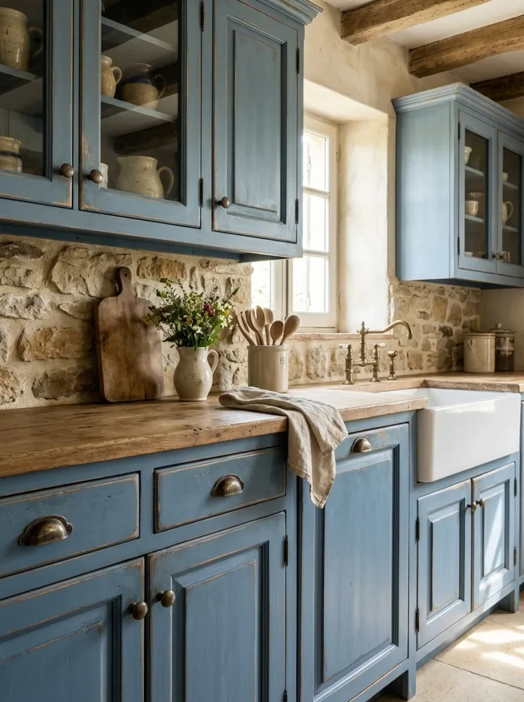
Quick Tip: Focus your sanding block strictly on the edges and corners where natural wear and tear would occur over decades. Avoid randomly distressing flat center panels to keep the technique looking authentic.
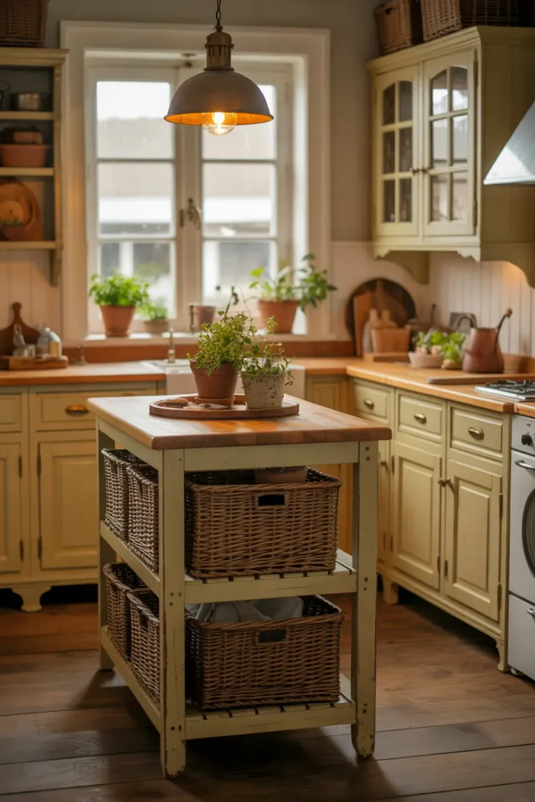
A slightly worn patina instantly gives brand-new woodwork a rich, historical soul. This romantic farmhouse style feels incredibly welcoming, forgiving everyday bumps and scratches effortlessly. I find that embracing imperfections creates a highly relaxed environment where guests feel immediately at ease sitting around the counter.
Monochromatic Color Drenching
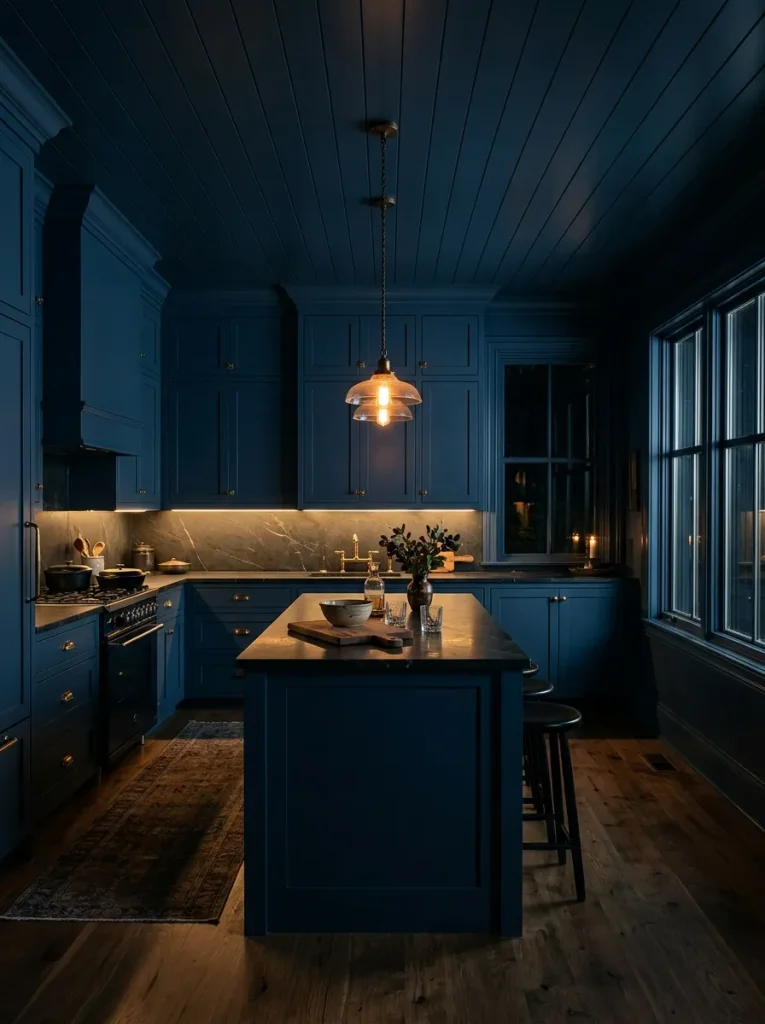
Before: Fragmented color schemes with contrasting walls and cabinets often chop up the visual flow. The room feels smaller because the eye stops at every hard transition line.
After: Painting the woodwork, walls, and trim the exact same shade blurs those boundaries completely. The layout suddenly feels endless, cohesive, and remarkably luxurious.
Wrapping the entire space in one continuous shade creates a deeply immersive sanctuary. Eliminating the contrast lines allows the cabinetry to blend seamlessly into the architecture. This bold commitment yields a highly sophisticated, enveloping atmosphere that feels like a private, exclusive lounge. I have seen this technique completely revitalize awkwardly shaped rooms by hiding odd wall angles beautifully.
Open Floating Shelving
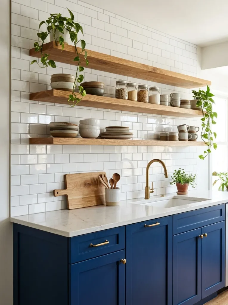
- Remove heavy upper boxes to instantly open up the top half of your layout.
- Install heavy-duty hidden brackets to support the weight of everyday ceramic dishes.
- Secure thick, natural oak slabs that complement the cool blue tones below.
- Arrange items by daily necessity, keeping everyday glasses on the lowest accessible tier.
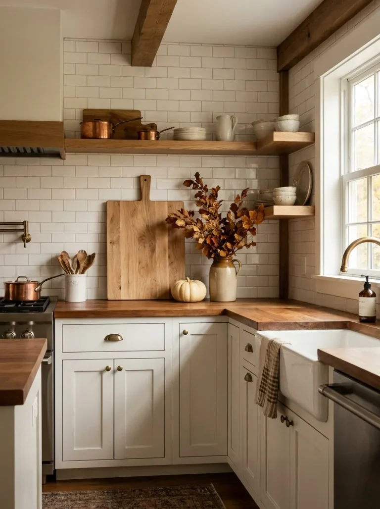
Swapping bulky overhead storage for streamlined planks creates brilliant visual breathing room. The natural wood grain introduces essential warmth that perfectly balances a bold painted foundation. This configuration encourages you to keep your favorite items beautifully organized, adding a highly personal touch to your daily cooking space.
Two-Toned Tuxedo Kitchens
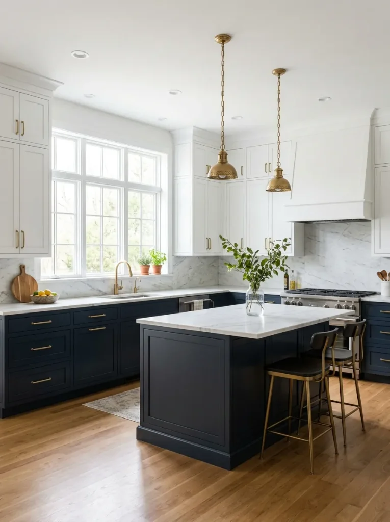
| Layout Strategy | Visual Weight | Room Atmosphere |
| All Dark Cabinets | Heavy and moody | Intimate and cozy |
| All White Cabinets | Light and clinical | Bright but sterile |
| Tuxedo (Dark Low/Light Up) | Perfectly balanced | Open and grounded |
Splitting your palette horizontally offers the absolute best of both design worlds. You gain the dramatic impact of a rich, bold hue without sacrificing essential daytime brightness. I have noticed this specific configuration remains incredibly popular because it flatters almost any footprint, regardless of square footage.
Copper Accent Pairings
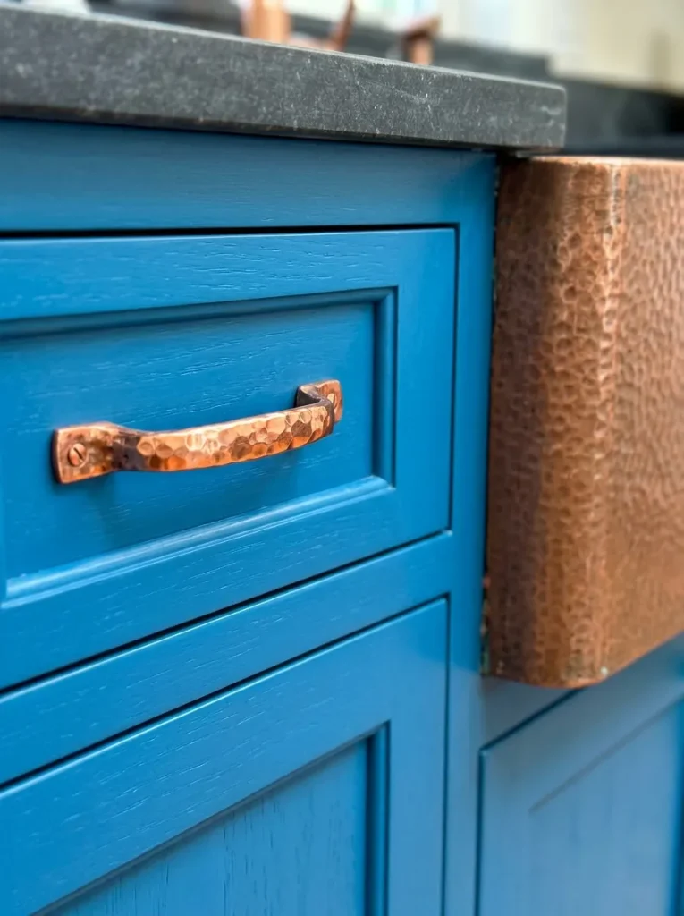
- Do embrace living finishes that develop a natural patina over time.
- Do match your cabinet hardware to a stunning metallic farmhouse sink.
- Do install warm task lighting to highlight the fiery metal tones.
- Don’t mix more than two different metallic finishes in the same room.
- Don’t polish raw copper if you prefer a rustic, aged aesthetic.
- Don’t forget to protect the metal from harsh acidic cleaners.
Introducing fiery, warm metals against a cool painted background creates a truly gorgeous contrast. The reflective qualities of copper bring immediate life and intense warmth into the space. This pairing feels simultaneously historic and fresh, elevating standard layouts into highly customized, professionally curated culinary environments.
CONCLUSION
Designing a bold, colorful cooking space is an incredibly rewarding process. Whether you decide to install classic shaker doors, update your hardware to brilliant gold, or fully embrace monochromatic drenching, these blue kitchen cabinet ideas offer endless ways to customize your home. Incorporating rich hues instantly brings life, character, and timeless charm to a room that families use every single day. I have seen how small color changes can completely shift the way a house feels, turning a basic utility zone into a vibrant gathering spot. If you loved these designs, be sure to save this post to Pinterest and share it with friends planning a renovation!