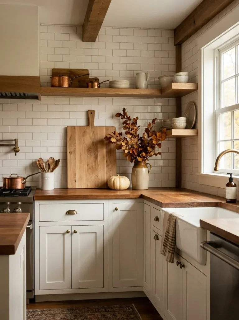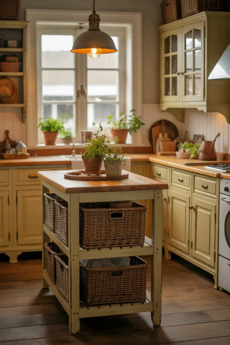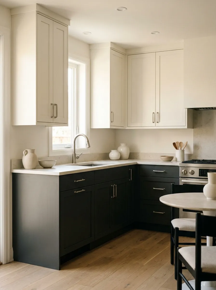
Dreamy Monochrome Small Kitchen Design Ideas on a Budget
A small kitchen can feel luxurious without a luxury renovation budget. Monochrome Small Kitchen ideas make it easier to create a polished, cohesive look using thoughtful color, texture, lighting, and affordable details.
The secret is not filling the room with more decor. It is choosing fewer elements and making each one work harder. Soft whites, warm grays, charcoal accents, natural wood, streamlined hardware, and layered textures can give a compact kitchen a sophisticated designer feel while keeping the space practical.
This guide brings together realistic ideas you can adapt to your existing cabinets, counters, floors, and accessories. In my experience, small changes such as updating hardware, clearing the counters, or adding warmer materials can noticeably change how a kitchen feels. Whether you are refreshing a rental or planning a budget makeover, these ideas can help you create a space that feels intentional, welcoming, and beautifully put together.
White Cabinet Contrast
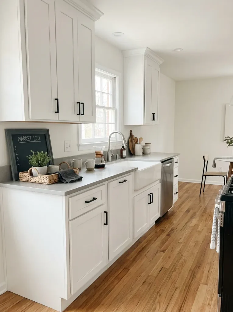
A monochrome palette can make a compact kitchen feel noticeably more open without requiring expensive remodeling. Start with warm white cabinetry and pair it with slightly darker counters or hardware. The small shifts in tone create depth while keeping the overall room visually calm and connected.
In my experience, contrast works best when one shade clearly dominates and the darker color appears in controlled doses. Black handles, a charcoal faucet, or slim lighting fixtures can define the room without making the cabinetry feel heavy. Keep larger surfaces light for a spacious, polished finish.
Matte Black Accents
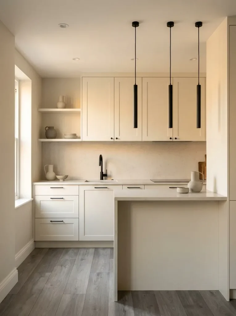
- Choose slim black cabinet pulls instead of replacing existing doors.
- Repeat black through the faucet, light fixtures, or a small frame.
- Keep dark accents concentrated around eye-level details.
- Select matte finishes to avoid a harsh, overly reflective appearance.
- Balance black elements with warm white or soft gray surfaces.
A few dark details can give a small cooking area sharper definition without overwhelming it. The key is repetition. When the same black finish appears in several places, the room feels intentional rather than randomly decorated. This approach also lets you refresh an existing kitchen with affordable hardware instead of costly replacements.
Soft Gray Countertops
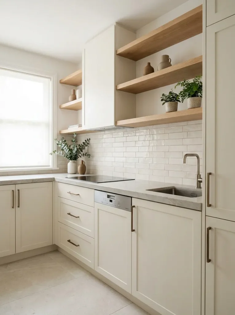
Quick Tip:
Choose a gray countertop with subtle movement rather than a heavily patterned surface. Look for remnants or discounted slabs when replacing the counter, especially for a small kitchen where less material is required. A warm gray usually pairs more comfortably with cream and oak than a cold blue-gray.
Soft gray counters create the middle tone that helps light cabinets and darker details work together. They hide minor crumbs and everyday marks better than bright white surfaces, which is useful in a busy cooking space. Pair the counter with a simple backsplash so the room retains its clean, restrained character.
Two-Tone Lower Cabinets
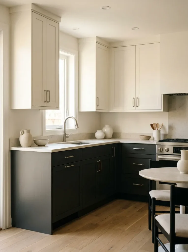
BEFORE:
The cabinetry looks flat because every surface shares nearly the same pale shade. Without visual separation, the compact layout can feel plain and slightly unfinished.
AFTER:
Deep charcoal lowers anchor the room while lighter uppers keep the eye moving upward. The countertop creates a clean transition between both tones, giving the kitchen more architectural definition.
Keep the darker color below waist height so it feels grounded rather than visually heavy. This approach works especially well with existing upper cabinets that can simply be repainted. Choose a durable cabinet enamel and test the color beside your countertop before committing to the full set of doors.
Open Wood Shelving
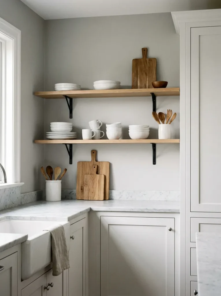
- Choose the wall: Select a short, unused section beside the upper cabinets or above a counter.
- Install slim shelves: Use two shelves rather than filling the entire wall, leaving generous space around them.
- Keep the palette restrained: Display white ceramics, clear glassware, and one or two wooden pieces.
- Repeat the wood: Match the shelving tone with a cutting board or small stool for visual continuity.
Open shelving introduces warmth without adding another strong color to the room. I’ve noticed that two carefully styled shelves often feel more expensive than a wall packed with accessories. Keep everyday pieces useful, such as mugs, bowls, or cutting boards, so the display remains practical rather than decorative clutter.
Light-and-Dark Backsplash
| Feature | Option A: Light Backsplash | Option B: Dark Backsplash |
|---|---|---|
| Visual effect | Airy and spacious | Dramatic and grounded |
| Maintenance | Shows some stains | Hides minor marks |
| Best pairing | Dark hardware | Light cabinetry |
| Budget approach | Paintable tile | Peel-and-stick tile |
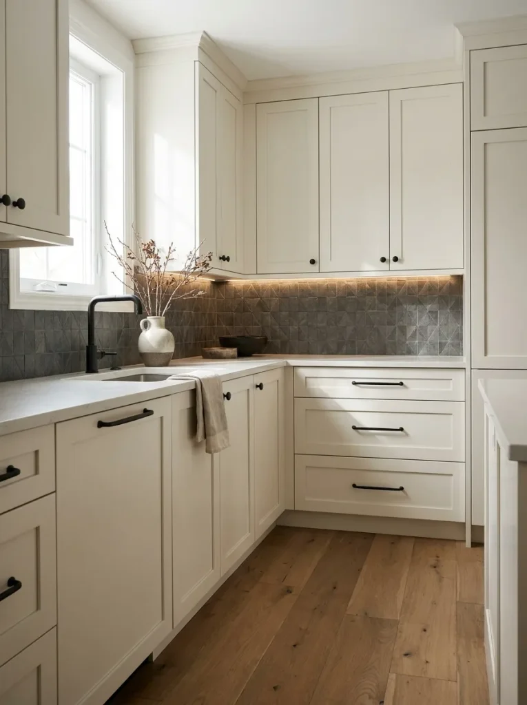
A darker backsplash can become the focal point while keeping the rest of the kitchen restrained. For a budget update, consider removable tile panels or painting suitable existing tile with a specialist product. Keep the countertop and cabinets lighter so the darker surface adds depth without shrinking the visual footprint.
Layered Neutral Textures
DO:
- Combine matte, woven, ceramic, and lightly textured surfaces.
- Keep most materials within the same neutral color family.
- Repeat one warm material, such as oak, in two or three places.
- Leave some surfaces completely plain for visual breathing room.
DON’T:
- Mix too many competing patterns in a compact room.
- Add several unrelated wood tones.
- Cover every counter with decorative objects.
- Combine very glossy finishes with excessive reflective accessories.
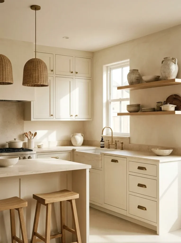
Texture gives a restrained palette enough depth to feel sophisticated rather than flat. A linen shade, handmade ceramic bowl, oak cutting board, and softly veined stone can create layers without introducing busy colors. The result feels especially polished when each material has room to stand out instead of competing for attention.
Warm Wood Details
Cost: Low to moderate | Time: One afternoon
Skill Level: Beginner | Best For: Renters and budget updates
Works In: White, cream, gray, and charcoal kitchens
Result: Warmer, more layered visual balance
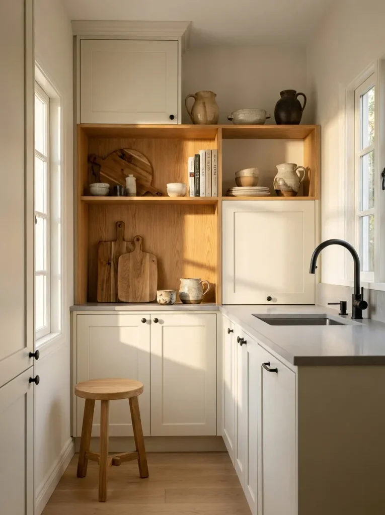
Warm wood prevents a limited color palette from feeling sterile or overly clinical. I’ve seen simple additions such as a wooden tray, stool, or pair of cutting boards create more visual warmth than buying several decorative accessories. Choose one wood tone and repeat it thoughtfully for a cohesive finish.
Streamlined Counter Styling
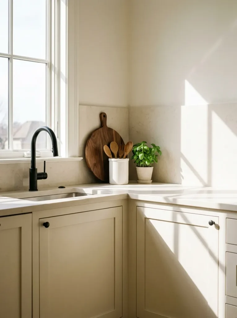
A clear countertop immediately makes a compact kitchen feel more spacious. Start by removing everything that does not serve a daily purpose, then return only the pieces you genuinely use.
Keep one cutting board, a small utensil vessel, and perhaps a compact plant or ceramic bowl. Grouping useful objects into small zones prevents visual clutter. I’ve noticed that this simple reset often makes a bigger difference than adding new decor, especially in kitchens with limited preparation space.
Slim Pendant Lighting
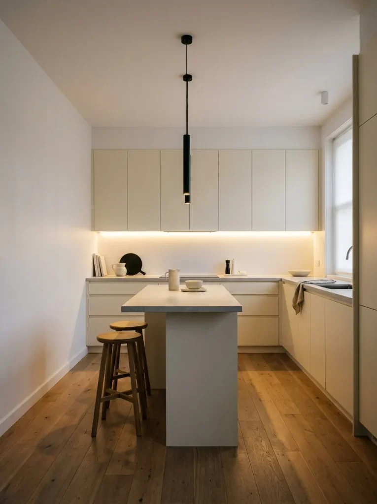
- Choose narrow pendants that do not visually crowd the ceiling.
- Repeat the fixture finish through cabinet hardware or the faucet.
- Hang lights high enough to preserve clear sightlines across the kitchen.
- Select warm white bulbs around 2700K to create a welcoming evening glow.
Lighting can change how every neutral surface appears after sunset. In a compact kitchen, slim fixtures provide character without taking up much visual space. Black pendants also create a useful vertical accent, drawing attention upward and making the ceiling feel more defined while keeping the overall palette controlled.
Minimal Ceramic Display
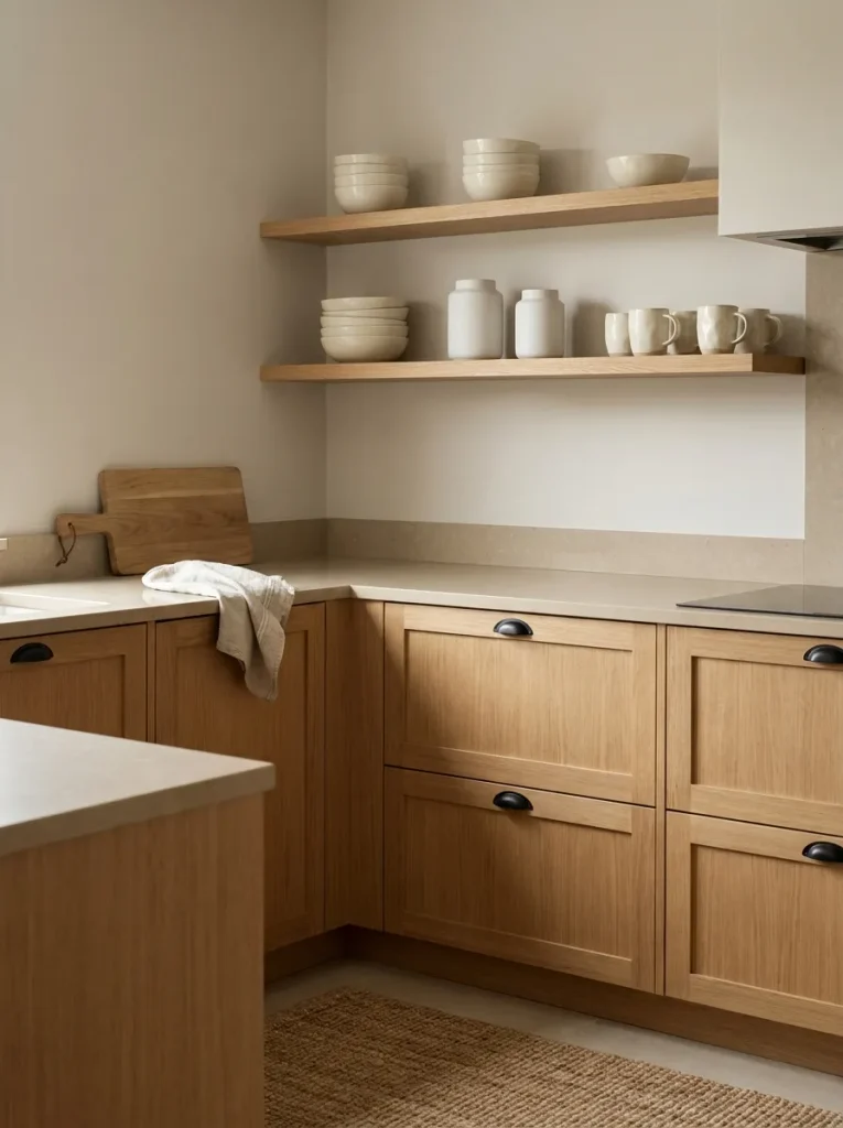
Quick Tip:
Group ceramics by shape and height instead of arranging every item in a straight row. Leave small gaps between pieces so the shelves retain visual breathing room. Choose matte ivory, cream, or soft gray finishes to maintain the monochrome character while adding handmade texture.
Ceramics are an affordable way to bring personality into a restrained kitchen without introducing distracting color. Mix bowls, mugs, pitchers, and small vessels in slightly different finishes. For a high-end look, repeat one dominant shade and vary the shapes rather than buying a matching collection.
Reflective Hardware Details
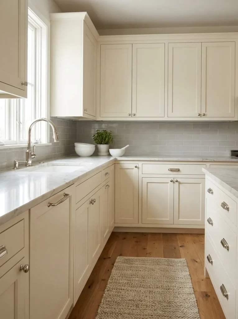
BEFORE:
Plain cabinet doors and a basic faucet leave the room looking visually flat. The limited palette has little contrast or detail to catch the eye.
AFTER:
Polished nickel hardware introduces small points of reflection across the cabinetry. Matching the faucet to those details creates continuity while keeping the larger surfaces calm and neutral.
Hardware is one of the easiest places to spend strategically when working with a tight budget. Measure existing holes before ordering replacements, and choose a consistent finish throughout the room. A coordinated set of pulls, knobs, and faucet details can make older cabinetry feel considerably more considered without replacing the doors.
Budget Cabinet Refresh
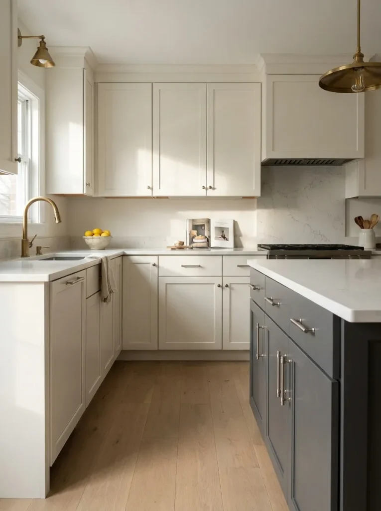
- Clean the doors: Remove grease and residue thoroughly so the new finish adheres properly.
- Lightly sand: Smooth the existing surface and remove loose or glossy areas before priming.
- Prime carefully: Use a bonding primer suited to the cabinet material.
- Apply thin coats: Paint with a durable cabinet enamel, allowing proper drying time between coats.
- Replace hardware: Install coordinated pulls or knobs once the doors are fully cured.
A cabinet refresh can deliver the biggest visual change without the expense of new cabinetry. Choose warm white, soft gray, or charcoal rather than stark extremes if you want a sophisticated result. For a compact room, painting the upper cabinets lighter and the lower cabinets darker creates useful contrast while preserving an airy appearance.
Compact Patterned Flooring
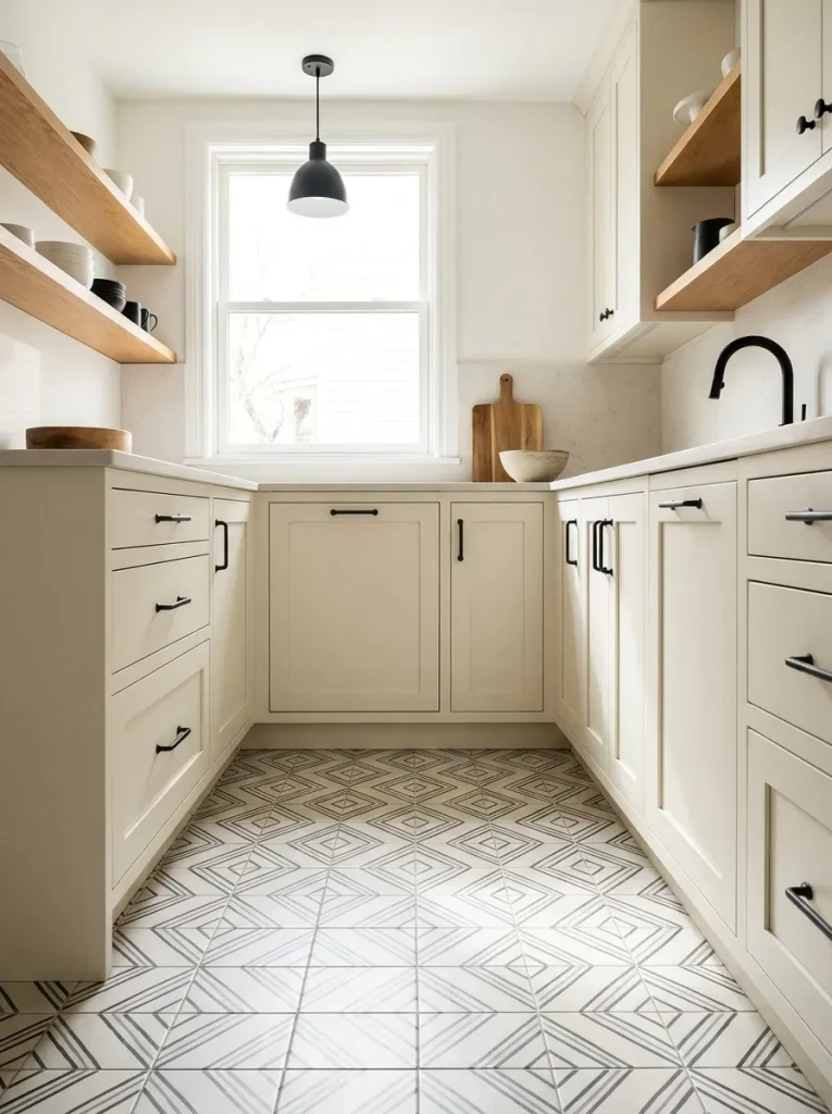
| Choice | Option A: Subtle Pattern | Option B: Bold Pattern |
|---|---|---|
| Visual impact | Quiet and refined | Strong focal point |
| Small-room effect | Keeps space feeling open | Can feel visually busy |
| Styling needs | Simple accessories work well | Minimal decor works best |
| Budget option | Peel-and-stick tiles | Statement tile installation |
A subtle floor pattern adds personality while keeping the walls and cabinetry visually calm. For a budget-friendly update, removable flooring can be useful in suitable spaces, especially for renters. Choose a small-scale geometric pattern in two related tones rather than several contrasting colors to keep the kitchen feeling cohesive.
Monochrome Window Treatments
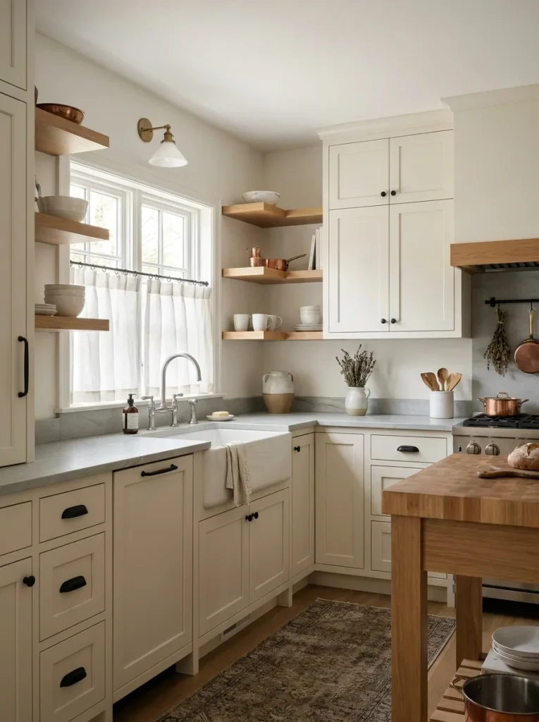
DO:
- Choose lightweight linen or cotton in white, cream, or soft gray.
- Mount the curtain close to the window frame for a tailored appearance.
- Keep patterns minimal or choose a solid fabric.
- Wash and steam the fabric regularly so it stays crisp.
DON’T:
- Use heavy curtains that block valuable natural light.
- Introduce a bright accent color unrelated to the room.
- Let fabric pool around counters or cooking surfaces.
- Choose oversized prints for a very small window.
Window treatments can soften hard cabinetry and make a compact cooking space feel more finished. Café curtains are particularly practical because they provide privacy while preserving upper-window light. A simple cream linen fabric also complements black hardware and gray surfaces without disrupting the restrained palette that gives the room its polished character.
A stylish small kitchen does not require a complete renovation or an oversized budget. Thoughtful colors, layered textures, warm wood, streamlined lighting, and carefully chosen accents can create a refined result with surprisingly simple changes. A Monochrome Small Kitchen also gives you a flexible foundation that can evolve as your style changes.
Start with one idea that fits your budget and build from there. I’ve seen how small changes can completely shift the way a space feels. Save this post on Pinterest for your next kitchen refresh, try your favorite ideas, and share it with someone planning a small kitchen makeover. Your dream kitchen may be closer than you think.